 |
mgsLib
1.3
Mermaja's Graphic Screen. A simple C library to build Windows graphic applications from console programs.
|
|
mgsLib
1.3
Mermaja's Graphic Screen. A simple C library to build Windows graphic applications from console programs.
|
The use of mgsLib in the laboratory during the first years after its creation showed that it was a simple to use, good tool to represent graphical data and to perform animations. For the first of these two groups the graphical representation followed a consistent phase of input of data and parameters using the console and plain text and the result was adequate. For the second case, the more graphically bound applications, console input was a strange operation, difficult to integrate with the overall look and feel of the program. The advanced mouse imput functions proved to be a good addition, but building complete input for the graphical applications still remained very complex if not impossible.
To solve this problem a rich set of input widgets has been added to this current version of mgsLib. These are high level input windows or fields with a complete set of functions for each of them which makes them easy to use but powerful enough to cope with the most usual input requirements of the applications. These widgets are conceived for the graphical applications that execute in animation loops and thus require to be handled during the application working and display phases. If this requirement is satisfied they are easy to integrate on the application following the explanations on the Widgets integration section.
The offered widgets come on two different groups:
Many widgets share similar properties so they have similar funcions or store similar data. Some of them are able of generating an asynchronous action on the program, so they hold a callback function that is called automatically during the operation of the widgets. The graphical look of them is important, so they offer functions to set its color and fonts. Also all the screen field widgets can be placed dynamically on the screen, enabled or disabled and most of them resized. The following sections present the set of widgets and their associated functions in detail.
While all the widget relative functions are contained in the same library file as the rest of mgsLib they have been designed as an optional, independent part. So to use mrmWidgets on your programs you have to include an specific header file, mrmWidgets.h. You can find the required files on the download page.
Once you have the header file, adding mrmWidgets is quite easy. But remember that to use them your applications flow has to be that of a mgsLib based animation: an infinite loop where work is done and then the screen is updated before the next iteration. Given that this is adequate for the application, handling widgets does only require calling two functions in the main loop:
With these two functions as the only required working part of the use of mrmWidgets your application has to deal only with the creation, positioning and confifuration of visual aspects of the widgets usually before the main loop, and possibly enabling or disabling widgets in response to your code activity during the loop. Of course this is only the simplest, normal use of the widgets, but the programer is free to change the aspect and other data of the widgets if it is suitable for his program. Information on how to create, configure and use the different types of widgets can be found on the following sections.
In addition to the previous functions, required in any program that uses mrmWidgets two more are included as general utilities: mrmWU3DRectangle() draws a rectangle with 3D effect as the ones used by most widgets and mrmWVersionData() returns information about the mrmWidgets library and its use of resources in the current application.
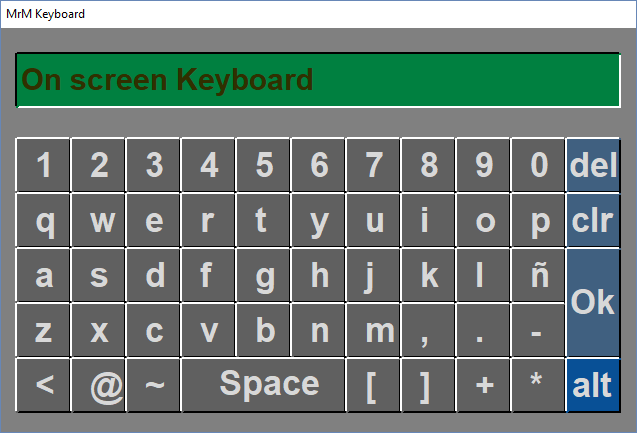
One of the most frustrating limitations of previous versions of mgsLib was the impossibility to enter normal text in a graphic application, in a simple way. To solve this lack, the current version of mgsLib includes an easy to use, On Screen Keyboard as depicted on the image. It is an indepedent window fully handled by the mrmWidgets system. Clicking with the mouse on any of the normal keys adds the corresponding character to the text that appears on the small display. There are are also a set of special keys of evident use:
The keyboard is created using the mrmKeyboardInit() function and deleted with mrmKeyboardDelete(). Note that only a keyboard can be present on any application at a time, and the text box widget may require creating one automatically to enter data. To detect and handle these conflicts the mrmKeyboardExists() function informs about the existence of the keyboard.
The function mrmKeyboardGetText() is used to get at any time the contents of the keyboard, that is, the text introduced by the user and present on the display. It also allows the user to read the state -blocked or not- of the keyboard. Calling this function when the keyboard is blocked automatically releases it and deletes its contents. One possible way of reading the input text only when the user has pressed Ok is calling mrmKeyboardGetText() inside the callback function. Please note that all the widget functionality relies on their execution inside a timed loop, so the callback function has to be light and non blocking.
Two additional functions, mrmKeyboardMove() and mrmKeyboardSetColors() allow to change respectively the keyboard position on screen and aspect.
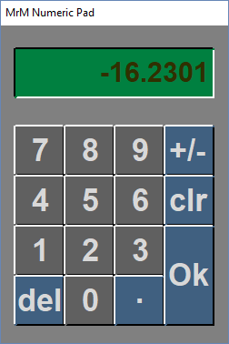
In addition to the full keyboard, a small on Screen Numeric Keypad as depicted on the image has been added to input numeric values. It is an indepedent window fully handled by the mrmWidgets system. Clicking with the mouse on any of the numeric keys adds the corresponding digit to the text that appears on the small display. There are are also a set of special keys of evident use:
The numeric pad is created using the mrmNPInit() function and deleted with mrmNPDelete(). Note that only a numeric pad can be present on any application at a time, and the text box widget may require creating one automatically to enter data. To detect and handle these conflicts the mrmNPExists() function informs about the existence of the numeric pad.
The function mrmNPGetText() is used to get at any time the contents of the numeric pad as a string, that is, the text introduced by the user and present on the display. It also allows the user to read the state -blocked or not- of the numeric pad. Calling this function when the numeric pad is blocked automatically releases it and deletes its contents. One possible way of reading the input text only when the user has pressed Ok is calling mrmNPGetText() inside the callback function. Please note that all the widget functionality relies on their execution inside a timed loop, so the callback function has to be light and non blocking. The function mrmNPGetVal() has the same functionality of mrmNPGetText() but returns the value tiped on the numeric pad as a floating point value.
Two additional functions, mrmNPMove() and mrmNPSetColors() allow to change respectively the numeric pad position on screen and aspect.
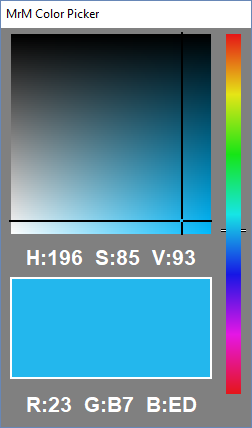
The Color Picker was created to be used in a particular application to create simpre 3D objects -maybe a very simple 3D engine will be added to mgsLib one day- and from it emerged the idea of adding a more complete set of widgets, so it has remained among the widgets in spite of its use, totally different from the rest of the widgets. It is an indepedent window fully handled by the mrmWidgets system. As with most of the similar tools found in design applications, clicking on the side bar changes the coordinates of the selection rectangle and clicking on it selects a color that appears on the bottom rectangle. The HSV and RGB components of the selected color are also displayed.
The color picker is created using the mrmCPInit() function and deleted with mrmCPDelete(). As with the other full screen widgets, mrmNPExists() detects its existence as any application can only have one color picker at any moment, and mrmCPMove() allows to place the window on the screen. The main working functions are mrmCPRGB() that returns the selected color and mrmCPSetSelection() that forces the color picker to have the given color selected.
The example file colorSelect.c uses the Color Picker to select the color of the rectangles of the image displayed here.
A text box is a simple and easy tool to read input text. It is simply a rectangular region that activates when the user clicks on it with the left mouse button, and then it allows to type in a text that can be read by the application. The text box shows the typed text and may contain a default one. mrmWidgets implements text boxes as rectangular regions carved in on the screen. They are created using the mrmTextBoxInit() function that specifies its basic parameters. Among them it is reguired to specifiy an existing screen, as this widged is displayed on it, and a keyboard -complete or numeric pad- used to enter the text. When the user clicks on the text box the selected keyboard will appear automatically on screen -unless another of the same type is already present- and when the user presses Ok the text will be completed and a callback funcion is executed if specified. As with all of the screen contained widgets, this function receives two parameters: the screen id and the text box id. This way several text boxes can share the same callback and use these values to identify the sender. The text box can be deleted by means of the mrmTextBoxDelete() and enabled or disabled using mrmTextBoxSetEnabled() or the macros mrmTextBoxEnable() and mrmTextBoxDisable().
Text boxes aspect and position on screen can be configured using mrmTextBoxSetPos(), mrmTextBoxSetSize(), mrmTextBoxSetColor(), mrmTextBoxSetFont() and mrmTextBoxSetFontColor(). The main working functions are mrmTextBoxSetText() and mrmTextBoxGetText(). The first of them allows to set a default text on the text box while the second reads the text typed by the user. It can be invoked inside the callback funcion to guarantee correct synchronization as is the easiest way to know that the user has ended the editing activity on a given text box.
A buton is a simple rectangular region with a label on it that triggers some action when the user clicks on it with the left mouse button. mrmWidgets implements buttons as rectangular regions carved out on the screen, that go down when pressed and triggers their action when released. Each button also has an associated counter that gets increased by 1 one ach user click. They are created using the mrmButtonInit() function that specifies its basic parameters. Among them it is reguired to specifiy an existing screen, as this widged is displayed on it. When the user clicks on the button, in addition to increase its counter a callback funcion is executed if specified. As with all of the screen contained widgets, this function receives two parameters: the screen id and the button id. This way several buttons can share the same callback and use these values to identify the sender. The button can be deleted by means of the mrmButtonDelete() and enabled or disabled using mrmButtonSetEnabled() or the macros mrmButtonEnable() and mrmButtonDisable().
Buttons aspect and position on screen can be configured using mrmButtonSetPos(), mrmButtonSetSize(), mrmButtonSetColor(), mrmButtonSetFont(), mrmButtonSetFontColor() and mrmButtonSetLabel(). The main working functions are mrmButtonSetCounter() and mrmButtonGetCounter() that write and read the counter value. In spite of the existence of the counter and its handling function, the most common way of use buttons as triggers of activity inside a program is by using their callback functions.
The example files colorSelect.c and colorStar.c use the counter associated to a button to exit the program. The screen generated by the first is displayed here and by the second, here.
A slider bar is a convenient tool to enter numerical values in a graphical way. They are composed by a bar with a cursor that moves along it, and two limiting values. The position of the cursor on the bar defines a value between the limits using a linear relation that also involves the bar length. mrmWidgets implements slider bars this way, as elongated vertical or horizontal rectangular regions carved in on the screen, with a cursor on them that can be moved along by pressing with the left mouse button and dragging. They are created using the mrmSliderInit() function that specifies its basic parameters. Among them it is reguired to specifiy an existing screen, as this widged is displayed on it, the bar position and the limiting values. The slider bar can be deleted by means of the mrmSliderDelete() and enabled or disabled using mrmSliderSetEnabled() or the macros mrmSliderEnable() and mrmSliderDisable().
Slider bars aspect and position on screen can be configured using mrmSliderSetPos() and mrmSliderSetColor(). The main working functions are mrmSliderSetVal() and mrmSliderGetVal() that allow the programmer to place the cursor at a position representing a given value or get the value according to the cursor position respectively.
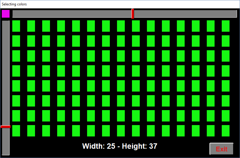
The example file colorSelect.c uses two slider bars to select the size of the rectangles of the image.
A list is a convenient tool to offer the user several data presented as a list to chose one item among them. Usually lists are presented as a rectangular field on screen, displaying the selected item. When the user clicks on it a window opens showing more items and possibly dispacement tabs if the list is too long. The user navigates the options and left clicks on one of them to perform its selection. Then the window closes and the new selected item is displayed on screen. mrmWidgets implements lists as a rectangular field carved in on screen, displaying the selected item. When the user clicks on it an independent window is opened below this field presenting the list of options and two up and down triangles. The user can displace the list up and down by clicking on these triangles or using the mouse wheel. If a selection is made the window is closed and the clicked element chosen; if the user clicks on the on screen field of the list, the window is closed and the selected option is not changed. Lists are created using the mrmListInit() function that specifies its basic parameters. Among them it is reguired to specifiy an existing screen, as this widged is displayed on it,and a mode to specifiy to keep the list ordered alphabetically. List also have an associated callback funcion that is called, if specified, when the user clicks to open the window or when the user clicks to close the window either by selecting a new option or by keeping it unchanged. This function receives three paramenters. As with all of the screen contained widgets, two of them specify the screen id and the list id. This way several lists can share the same callback and use these values to identify the sender. The third parameter identifies wheter the user opened the window list, selected a new item or closed it without selection. The list can be deleted by means of the mrmListDelete() and enabled or disabled using mrmListSetEnabled() or the macros mrmListEnable() and mrmListDisable().
Lists aspect and position on screen can be configured using mrmListSetPos(), mrmListSetSize(), mrmListSetColor(), mrmListSetFont() and mrmListSetFontColor(). The main working functions for list can be grouped in two main sets. One of them contains functions for managing the items of the list and includes mrmListAddItems(), mrmListInsertItem() and mrmListDelItem(). The second deals with item selection and inspection and is composed of mrmListSetSelected(), mrmListGetSelected() and mrmListItemAtIndex().
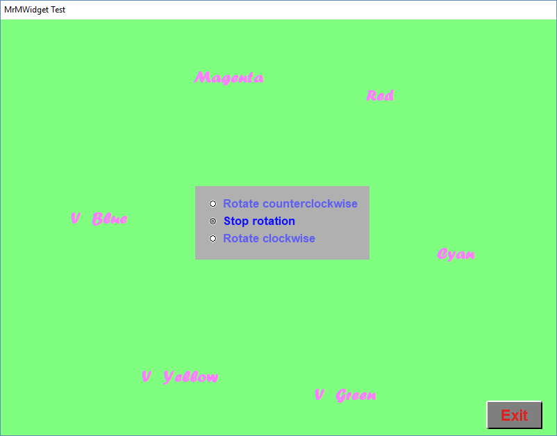
Selection lists, also called combo boxes or lists of check boxes are a group of options shown on screen at a time and the user can click on them to select one or several among them. Usually a tick box is displayed with each text, to show the selected an unselected options. Some allow one and only one option to be selected while other allow to select several of them. mrmWidgets implements Selection lists as a group of textual options with an optional tick box or tick character at the left of each one. When no tick element is used, the different color of the selected options serve to higlight them. Two types are automatically handled by mrmWidgets:
Selection lists aspect and position on screen can be configured using mrmSelectionSetPos(), mrmSelectionSetColor(), mrmSelectionSetFont() and mrmSelectionSetFontColor(). The main working functions for Selection lists are mrmSelectionSetVal(), mrmSelectionSetVal() to set or read the selected options.
 1.8.13